Work
Usability testing, UX, wireframing, prototyping, interaction design, animation, QA.
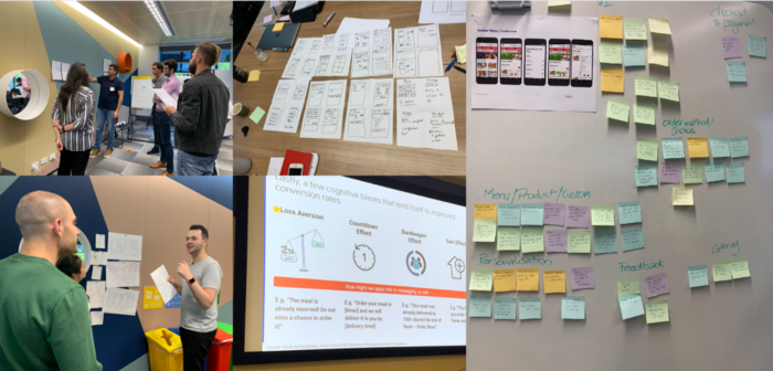
Sprint Before You Walk:
We kicked off the project with a full design sprint to identify pain points in the existing sites, involving analytics reviews, customer journey mapping, and usability testing. We discovered that the button layout was not effective. To measure success and assess the current state of the website, we partnered with Google to implement a set of metrics, goals, and trackers to benchmark site performance. Our findings and recommendations were presented at a Google Design Sprint with the KFC team.

Merge, Streamline, Optimise, Convert:
Guided by the brief to merge, streamline, optimize, and convert, my team produced mobile-first wireframe flows mapping out all possible customer journeys, including edge cases. This ensured a smooth transition through to development. We had to consider principles of good design, business rules, limitations such as POS systems, and human factors like device usage, age, and location. Every decision was backed by data from analytics or usability testing results.

UX Enhancements:
A major effort was put into reducing the number of clicks required to perform tasks. For example, we automated store setting based on a customer’s location, which also allowed customers to see live prices and product availability. We added micro-interactions to provide feedback, such as the cart icon shaking when an item is added, and used mobile designs for product pages on desktop, appearing as slide-overs rather than opening new pages.

The Result:
Since the site lauch we’ve recieved great feedback that the user experience has drastically improved, and seen promising signs of conversion uplift.
Just wanted to say a BIG thank you and congrats on successfully launching our new e-commerce website! We appreciate your support, expertise, and most importantly, collaboration with all our suppliers on this project.