Toyota Used Vehicles - Digital Online Automotive Retail
Work
UX, User Testing, Interaction Design, Product Design
Client
Toyota
After the launch of Toyotas redesigned used cars platform, the team took to improving the experience based on customer feedback, analytics and a fresh perspective.
I worked on a number of projects aimed at improving the overall usability and ultimately conversion of Toyotas used car marketplace.
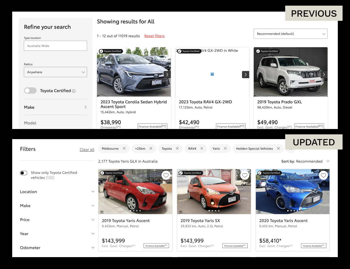
Listing page UX improvements
On review, I indenified a number of areas to optimise and improve the overall usability and clean up the layout of the listing page template.
Showing applied filters greatly improved the visibility of system status - huge UX improvement for mobile
Combining “showing results” and “x results” reduced visual clutter
Collapsing filters into accordions improved scalability and overall usability - especially on mobile
Removing darker panels borders and drop shadows shifted visual focus back to the product tiles
Improved the UX copy of the sorting options for clarity and usability
Before and after a number of UX uplifts
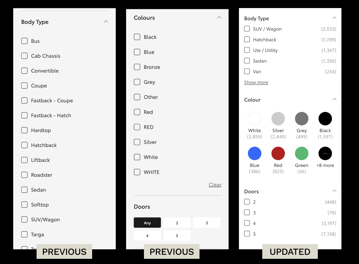
Filter panel redesign
To coincide with improvements to the listing page, I worked to redesign the filter panel in order to apply ecommerce best practice guidelines, and significantly improve the overall usability of the listing page.
Displaying the scope (number of listings) that apply within a filter option
Clarifying UX copy and layout of location filterImproving usability and function of make/model/grade filter
Providing predefined ranges to select + free text input for all numerical filter options (price, year, odometer)
Collapsing all options by default to improve scannability
Moving the clear all button into the filter panel
Reducing the number of typestyles for increased clarity
Order category lists by popularity for improved usability
Order numerical lists in ascending order
Truncate lists longer than 5 with a “Show more” button
Group similar colours into swatches and order by popularity
Allow multiple select on all options
Before and after updates to the filter panel
Testing code examples
In order to better test complex interactions such as selecting a make>model>variant, I worked on producing working code examples that I could test with users
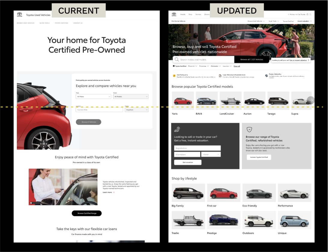
Homepage redesign
The homepage is your front door, a users first impression of what your site offers.
An effective homepage:
Helps users understand what site they're on
Gives users a sense of what they can do
Shows what type of products are available
Gives users a consistent (and useful) place to return to
Guide the user to a particular set of actions
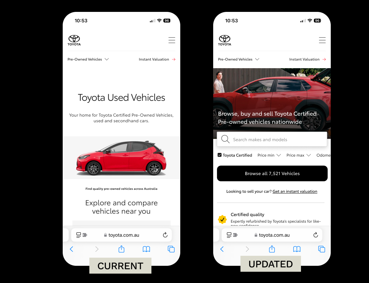
At launch, the homepage still had a few opportunities for improvement. Our site analytics show that over 80% of engaged users do not scroll past the site header, and don't engage with the quick search panel, and simply browse all vehicles - leading to a less than optimal browsing journey.
The current header is not an effective use of space
I launched a proactive piece of work to apply some of the best ecommerce guidelines for well performing homepages, including:
Overall focus on function over style
Reducing the overall size of the hero and H1 to move more content above the fold aiding scannability
Improving the quick search panel with a simpler model/grade search and additional advanced filter options
Introducing thematic categories for alternative browsing methods
More compact overall layouts allow for better scannability and the introduction of more entry points into different types of searches (Body type, price, odometer, local dealer, popular makes, popular Toyota models)
The updated design prioritises adding advanced filters and browsing options above the fold
The improvements are noticeable on mobile, with a lot of functionality brought above the fold